Caps Lock Considered Harmful: Difference between revisions
mNo edit summary |
mNo edit summary |
||
| Line 1: | Line 1: | ||
[[Image:Caps Lock.jpg|left| | [[Image:Caps Lock.jpg|left|frame]] | ||
''This piece is a argument justifying the prohibition of using all upper-case letters when participating in guild chat. [http://www.myextralife.com/forum2/viewtopic.php?f=22&t=9451 The thread containing the original version] can be found in the guild forums.'' | ''This piece is a argument justifying the prohibition of using all upper-case letters when participating in guild chat. [http://www.myextralife.com/forum2/viewtopic.php?f=22&t=9451 The thread containing the original version] can be found in the guild forums.'' | ||
Revision as of 20:33, 4 April 2009
This piece is a argument justifying the prohibition of using all upper-case letters when participating in guild chat. The thread containing the original version can be found in the guild forums.
If the fact that uppercase text is considered rude by convention is not enough to satisfy you, I can make a stronger argument.
Text that is lowercase carries more information in the shape of the words than text that is all uppercase. The fact that some lowercase characters have "descenders" that drop below the baseline and only some (not all) have "ascenders" that rise above the median.
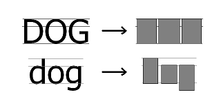
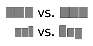
Consider D, O, and G. In the uppercase all three letters have a portion between the baseline and the median and a portion that is above the median. If I draw a small black rectangle over each letter that is just large enough to cover the entire character, I'm left with three nearly identical rectangles with identical placement.
However, the lowercase versions are quite different. Lowercase d extends from the baseline to the same point that the uppercase letters do, o only covers the region between the median and the baseline, and g extends from the median to a point below the baseline. If I cover these characters with the smallest rectangle possible, I can see distinct difference between the regions occupied.
Another way to state this is that the lack of deviation in the regions occupied by individual uppercase characters gives the shape of uppercase characters a higher degree of information entropy. There is a higher degree of uncertainty as to which letter is represented by a character based on which regions of a line it occupies when you are limited to only uppercase.
So what does this mean in the real world? In situations where text is difficult to read or where it flashes by too quickly for all the characters to be read, there is a greater chance of misreading the text. For this very reason, British road signs that must be read quickly do not use all uppercase. For further details, please check out Stop Stealing Sheep, by Erik Spiekermann, or Writing Systems, by Geoffrey Sampson.
As for how this applies to guild chat, the natural tendency of people in a cacophonous forum is to distinguish their text in some way. This leads to inevitable escalation as it becomes necessary to emphasize the text that does not have the distinguishing characteristic, until the feature that distinguished becomes the norm. We have had to deal with members who shouted in all caps because they felt that it was the only way to be heard.
If this is allowed to happen with strictly uppercase text, we will quickly see guild chat become even more difficult to read than it already is. Is that sufficient justification?
--Stigg 20:30, 4 April 2009 (UTC)


